Jun 092018


Dorothea Lange Children and home of cotton workers at migratory camp in southern San Joaquin Valley, CA 1936


My long time pal Jesse Colombo, now at Real Investment Advice, recently linked on Twitter to a Zero Hedge article, which quoted CoreLogic as saying more than half of American homes are overvalued. CoreLogic calls itself “a leading provider of consumer, financial and property data, analytics and services to business and government.”

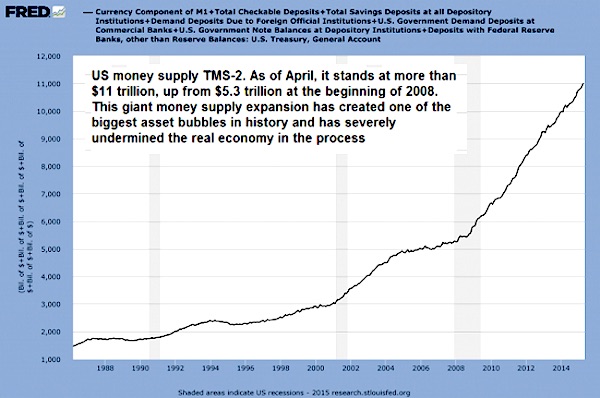
Well, CoreLogic is way off. All American homes are overvalued. How can we tell? It’s easy. It’s so easy it’s perhaps no wonder that people overlook the reasons why. But we all know them: The Fed has pushed some $20 trillion down the throats of the financial system. It has also lowered interest rates to near zero Kelvin. Then the government added a “relaxation” of lending standards and an upward tweak of credit scores. And Bob’s your uncle.

These measures haven’t influenced just half of US homes, they’ve hit every single one of them. Some more than others, not every bubble is as big as San Francisco’s, but the suggestion that nearly half of homes are not overvalued is simply misleading. It falsely suggests that if you buy a home in the ‘right’ place, you’ll be fine. You won’t be. The Washington-induced bubble will and must pop, and precious few homes will be ‘worth’ what they are ‘worth’ today.

Here’s what Jesse tweeted along with his link to the Zero Hedge article:

“Almost half of the US housing market is overvalued” – this is why U.S. household wealth is also overvalued/in an unsustainable bubble.

He followed up with:

U.S. household wealth is in a bubble thanks to Fed-inflated asset prices. This is creating a “wealth effect” that is helping to drive our spurious economic recovery. This economy is nothing but a sham. It’s smoke and mirrors. Wake the F up, everyone!!!

My reaction to this:

Sorry, my friend Jesse, but every single US home is overvalued. It just depends on the vantage point you look from. All prices have been distorted by the Fed’s policies, not just half of them. Arguably some more than others, but can that be the core argument here?

Jesse’s reply:

Yes, that’s a good point.

Another long time pal, Dave Collum, chimed in with a good observation:

I think even us bunker monkeys start recalibrating, no matter how hard we try to maintain what we believe to be perspective.

Yes, we’ve been at this for a while. Even if Jesse was still a student when he started out. We’ve been doing it so long that he recently wrote an article named: Why It’s Right To Warn About A Bubble For 10 Years. And he’s right on that too.

Let’s get to the article the conversation started with:


More Than Half Of American Homes Are Overvalued, CoreLogic Warns

CoreLogic reports that residential real estate prices nationwide increased 6.9% year over year from April 2017 to April 2018. The firm’s Home Price Index (HPI) also shows a 1.2% rise on the month-over-month basis from March to April 2018. This has certainly sparked the debate of housing affordability across the nation with many millennials struggling to achieve the American dream.

CoreLogic Market Condition Indicators showed that 40% of the 100 largest metropolitan areas were overvalued in April, compared to 28% undervalued, and 32% in line with valuations. The report uncovers a shocking discovery that of the nation’s top 50 largest residential real estate markets, 52% were overvalued in April.

CoreLogic’s methodology behind overvalued housing markets “as one in which home prices are at least 10% higher than the long-term, sustainable level, while an undervalued housing market is one in which home prices are at least 10% below the sustainable level.”

The CoreLogic people probably mean well, but they also probably don’t want to rattle the cage. It’s not really important. As soon as someone starts talking about a ‘sustainable level’ for home prices, you can tune out. Because no such thing exists. Unless you first take those $20 trillion out of the ‘market’, free up interest rates, tighten lending standards and lower credit scores. Only then MAY you find a ‘sustainable level’ for prices.

Historically a house in the US cost around 3 to 4 times the median annual income. During the housing bubble of 2007 the ratio surpassed 5 – in other words, the median price for a single-family home in the United States cost more than 5 times the US median annual household income. According to Mike Maloney, this ratio is heavily influenced by interest rates. When interest rates go down the affordability of a house goes up, so people spend more money on a house. Interest rates have now been falling since 1981 when they peaked at 15.32% (for a 10-year US treasury bond).

Mike Maloney, another longtime friend of the Automatic Earth, is dead on. Price to income is a useless point unless you include interest rates in the calculation. And then you can get large differences. Since interest rates have been falling for 37 years, count on them to rise. And see what that does to your model.

“The best antidote for rising home prices is additional supply,” said Dr. Frank Nothaft, chief economist for CoreLogic. “New construction has failed to keep up with and meet new housing growth or replace existing inventory. More construction of for-sale and rental housing will alleviate housing cost pressures,” Nothaft added.

Right, yeah. Now we know the CoreLogic mindset. The more you build, the better home prices will be. Just one of many problems with that is that if you really expect prices to fall once you build, people will build fewer houses, because profit margins fall too. The whole idea that we can save housing markets by simply building ever more has never rung very true. But that’s for another day.

In a recent op-ed piece via The Wall Street Journal, Paul Kupiec and Edward Pinto place the blame on the government for creating another real estate bubble through “loose mortgage terms pushing home prices up.” They claim that mortgage underwriters need to tighten standards.

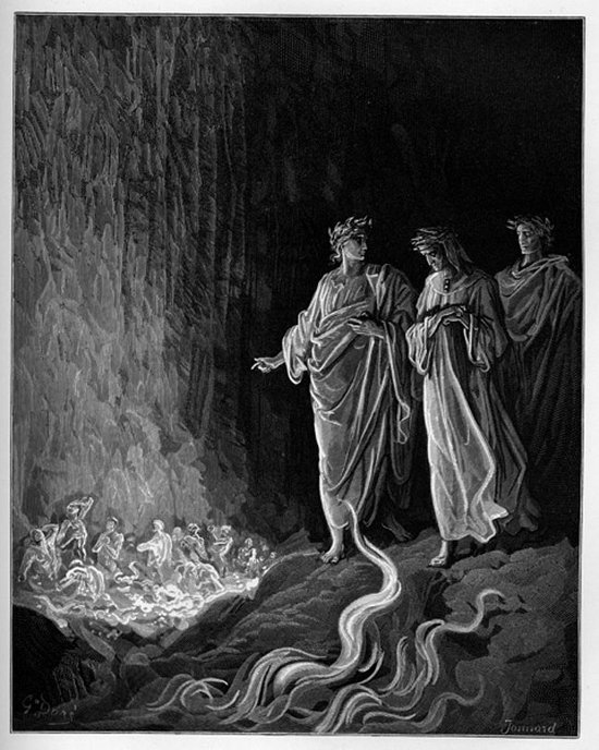
“Home prices are booming. So far, 2018 has posted the strongest growth since 2005. “About 60% of all U.S. metros saw an acceleration in the rate of price increases through February this year,” according to Housing Wire. Since mid-2012, real home prices have increased 28%, according to data from the American Enterprise Institute. Entry-level home prices are up about double that rate. In contrast, over the same period household income has barely kept pace with inflation. The current pace of home-price inflation is increasing the risk of another housing bubble.

The Fed is raising rates -finally- and home prices grow at the fastest rate in 13 years. Over the past 6 years prices are up 28%. Entry level homes are up more than 50% in that time frame. That is just profoundly scary. It’s like Dante’s descent into hell. And no, it’s not true that “The current pace of home-price inflation is increasing the risk of another housing bubble”. We’re already caught up head first in a new housing bubble.

“The root of the problem is declining underwriting standards. In April Freddie Mac announced an expansion of its 3% down-payment mortgage, the better to compete with the Federal Housing Administration and Fannie Mae . Such moves propel home prices upward. Because government agencies guarantee about 80% of all home-purchase mortgages, their underwriting standards guide the market.

Making lending even more dangerous, CNBC recently reported that “credit scores may go up” because new regulatory guidance allows delinquent taxes to be excluded when calculating credit scores. These are only some of the measures that “expand the credit box” and qualify ever-shakier borrowers for mortgages.”

As I said before: if you lower lending -and underwriting- standards and artificially raise credit scores, then yes, you can keep the bubble going for a while longer. But it overvalues properties. You’re just moving goalposts.

“During the last crisis, easy credit led home prices to rise at an unsustainable pace, leading marginally qualified borrowers to stretch themselves thin. Millions of Americans’ dreams became nightmares when the housing market turned. The lax underwriting terms that helped borrowers qualify for a mortgage haunted many households for the next decade.”

No, it’s not just homes. Stocks and bonds as just as overvalued. Because of a behemoth attempt at making the economy look good, even though it’s entirely fake. No price discovery, no market, just central banks and tweaking standards and surveys. C’mon, we all know where this must go. We just don’t want to know. So this Marketwatch piece gets a wry smile at best:


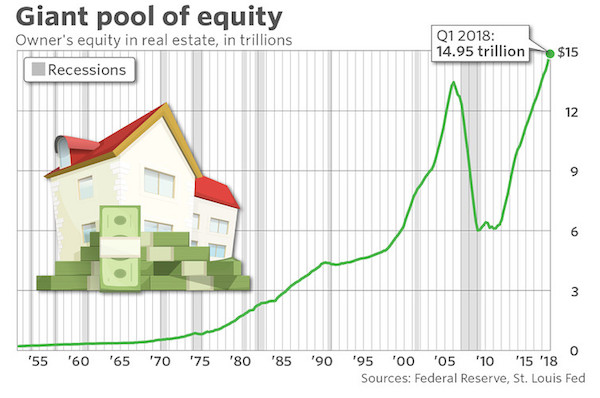
America Is House-Rich But Cash-Poor

The housing market has not only recovered from the Great Recession, it’s heated up. According to an analysis from Attom Data, nearly 14 million Americans are now “equity rich” – meaning they have at least 50% equity in their homes. It bears repeating that many owners and communities are not so lucky: over a million Americans are underwater, and some cities and towns are still reeling under the weight of abandoned and vacant homes and stagnant micro-economies. But for most of the country, rapidly rising home prices and a dearth of anything else to buy means people are staying in their homes longer, allowing them to accrue more and more equity: $15 trillion worth, to be exact.


Sep 272017
 
 September 27, 2017  Posted by at 1:31 pm Finance Tagged with: , , , , , , , ,  8 Responses »


Fan Ho Construction 1952


You would think, certainly if you were as naive and innocent as I am, that when you get offered the job of Chair of the Federal Reserve, you must be sure, before accepting, that you have the credentials and the knowledge required. If you don’t, it looks as if you don’t take the job seriously. Janet Yellen, who’s been Chair since January 2014, doesn’t seem to agree.

In a speech Tuesday for the National Association for Business Economics Yellen ‘honestly’ admitted that she doesn’t understand inflation, control of which is the Fed’s no.1 task (it’s debatable whether that’s a good idea). She doesn’t understand a bunch of other issues either. Those are her own words, not mine. Here are these own words:

“My colleagues and I may have misjudged the strength of the labor market, the degree to which longer-run inflation expectations are consistent with our inflation objective, or even the fundamental forces driving inflation..”

Clear enough, you would think. But she didn’t offer her resignation. And for an important post like Fed chair, that is a major problem. As she undoubtedly does. So why is she keeping her job? Doesn’t she realize that when you don’t understand the issues you deal with, you’re prone to make disastrous mistakes?

Yellen and her colleagues work with models, and the models are wrong. The Fed’s predictions for things like inflation are ridiculously off, all the time. That may be news to her, but it’s old hash for many people in her field. So that she’s surrounded solely by people who don’t understand these things either is not an excuse.

So what does she expect now? That she will start to understand them all of a sudden, after years and years of not being able to? That reality will change to comply with her models? We can discount the option that she will suddenly begin using entirely different models, they’re all she has. But what then?

Under her predecessor Ben Bernanke, who never conceded he had no idea either but still didn’t, the Fed lowered interest rates to near zero Kelvin and bought trillions of dollars in bonds and securities. Now Yellen for some reason thinks it’s time to get rid of the stuff.

But on what basis does she make such a decision, if she self-admittedly doesn’t even understand the fundamental forces in play? How is that different from handing a box of matches to a 3-year old? Isn’t she really simply an academic dropped in a casino? From CNBC:

Yellen said a regular pace of rate hikes ahead is likely still warranted, though Fed officials are looking closely at the assumptions underlying those projections. While conceding that the Fed may need to slow the removal of accommodation, she also said the central bank “should also be wary of moving too gradually.”

There comes a point when naive innocent me starts asking: what does that even mean? Rate hikes are warranted but we don’t know why? Accommodative policies have been going too fast but they shouldn’t be too slow? Based on what? It can only be based on models that have proven faulty, can’t it, because they have no others.


Here are a few pointers for the occupants of the Marriner S. Eccles Federal Reserve Board Building. Inflation is money velocity multiplied by money and credit supply. MV = PY. M is money supply, V is velocity, P is price level and real GDP is Y.

Velocity of money means consumer spending. 70% of US GDP is consumer spending. But American consumers are neck deep in debt and have very little money left to spend. Much of what they spend, they must borrow.78% of Americans live paycheck to paycheck. So forget about money velocity.


Moreover, as for the Fed’s second mandate after inflation, full employment, they don’t get that one either. They seem to act on the presumption that any one job is just like the other. And then bleat: “My colleagues and I may have misjudged the strength of the labor market”.

But America has turned into a nation where the gig economy (the natural successor to first the knowledge economy, then the service economy), waiters, greeters and people working 3 jobs just to make ends meet have become the norm. When in the present circumstances you claim to have almost ‘achieved’ full employment, as Yellen and the Fed do, you must really be blind as a bat.

The other side of the equation is money supply. Interestingly, the Fed has issued tons of it, but handed it all to its owner banks. If they had spent it inside the economy itself, we could have been looking at a whole other picture. If those trillions would have gone to investment, manufacturing etc., instead of propping up banks and companies buying their own shares, Yellen might have actually seen some inflation.

If Americans have no money to spend, there can not be inflation. Simple. But the same stupid faulty predictions just keep coming:


So why is anybody still paying attention to Janet Yellen? Well, because she has her finger on the biggest financial trigger on the planet. No matter how shaky and uneducated that finger may be. Or do we pay attention exactly because we know what’s behind that shaky finger? Do we all put everything on red just because grandma does it too?

The craziest thing of all is that in reactions in the media to Yellen’s speech, she’s praised for admitting she has no clue what she’s doing. That takes the cake. And eats it too. Praised for admitting you’re terribly unfit for your job. That’s just great. That’s Bizarro world.

It’s well past best before time to get rid of Janet Yellen, and all the intellectual but idiots who work at the Fed. What is it, 1,000 PhDs, or was that 10,000? But the only thing that makes any real sense of course, the only thing that can save the nation, is to get rid of the Fed and its braindead mandates, interests and occupants altogether.

Hedgeye got this one painfully right:


And yeah, I know Yellen could be fired too if she doesn’t resign, but with Goldman Sachs all over the White House, what are the odds? And who would come in when she goes? She’s ideal, who’s going to get angry at a barely 5′ grandmother even is she clearly out of her depth and league?


Dec 182015
 
 December 18, 2015  Posted by at 6:15 pm Finance Tagged with: , , , , , ,  9 Responses »


DPC Times Square seen from Broadway 1908

I was reading something yesterday by my highly esteemed fellow writer Charles Hugh Smith that had me first puzzled and then thinking ‘I don’t think so’, in the same vein as Mark Twain’s recently over-quoted quote:

“It ain’t what you don’t know that gets you into trouble. It’s what you know for sure that just ain’t so.”

I was thinking that was the case with Charles’ article. I was sure it just ain’t so. As for Twain, I’m more partial to another quote of his these days (though it has absolutely nothing to do with the topic:

“Eat a live frog first thing in the morning, and nothing worse will happen to you the rest of the day.”

Told you it had nothing to do with anything.

Charles’ article deals with money supply and the velocity of money. Familiar terms for Automatic Earth readers, though we use them in a slightly different context, that of deflation. In our definition, the interaction between the two (with credit added to money supply) is what defines inflation and deflation, which are mostly -erroneously- defined as rising or falling prices.

I don’t want to get into the myriad different definitions of ‘money supply’, and for the subject at hand there is no need. The first FRED graph below uses TMS-2 (True Money Supply 2 consists of currency in circulation + checking accounts + sweeps of checking accounts + savings accounts). The second one uses M2 money stock. Not the same thing, but good enough for the sake of the argument.

In his piece, Charles seems to portray the two, money supply and velocity of money, as somehow being two sides of the same coin, but in a whole different way than we do. He thinks that the money supply can drive velocity up or down. And that’s where I think that just ain’t so. I also think he defeats his own thesis as he goes along.

Before going into details, two things: One, he doesn’t mention the term deflation even once, though he shows money velocity has been going off a cliff like a mountain range and a half full of lemmings. I find that curious.

Two, he doesn’t mention consumers in the context. That can’t be right either. 70% of US GDP is consumers. You can’t ignore that. You can’t just look at financial markets, at investors, even though they use up most of the stimulus, and think they are the main factor determining money velocity. Not when they’re less than a third of GDP.

Moreover, and this I think is crucial, the velocity of money talks to you about consumers in a way that the money supply never could.

There may be ‘positive’ reports coming out of the BLS on jobs numbers, but with 94+ million Americans not in the labor force, with the quality of jobs diminishing so fast and so profoundly that the middle class is all but disappearing, and with 40+ million US citizens on foodstamps, the impact of the deteriorating spending power of ‘consumers’ on money velocity had to be so enormous you can’t ignore them.

Simply because if and when people have a lot less to spend, velocity comes down. That there is even the very heart of deflation. Here’s Charles with my comments:

Money Velocity Is Crashing – Here’s Why

The inescapable conclusion is that Fed policies have effectively crashed the velocity of money.

I’ll get back to that, but no, it is not true.

That the velocity of money has been crashing while the money supply has been exploding doesn’t seem to bother the mainstream pundits. There is always a fancy-footwork explanation of why whatever is crashing no longer matters. Take a look at these two charts and tell me money velocity doesn’t matter.

No argument about that from me.

First, here’s money supply: notice how money supply leaped from 2001 to 2008 as the Federal Reserve pumped liquidity and credit into the economy, and then how it exploded higher as the Fed went all in after the Global Financial Meltdown.

Now look at a brief history of the velocity of money. There are various measures of money supply and various interpretations of velocity, but let’s set those quibbles aside and compare money velocity in the “golden era” of the 1950s/1960s and the stagflationary 1970s to the present era from 2008 to 2015-the era of “growth”:

Notice how the velocity of money remained in a mild uptrend during both good times and not so good times. The inflationary peak of 1979-1982 (Treasury yields were 16% and mortgages were 18%) generated a spike, but velocity soon returned to its uptrending channel. The speculative excesses of the dot-com era pushed velocity to unprecedented heights.

Given the extremes in velocity, it is unsurprising that it quickly fell in the dot-com bust. The Federal Reserve launched an unprecedented expansion of money, credit and liquidity that again pushed velocity up in the speculative frenzy of the housing bubble. But note that despite the vast expansion of money supply, the peak in the velocity of money was considerably lower than the dot-com peak.

OK, that’s the core of why I started thinking I was sure it just ain’t so. What Charles asserts here is that an expansion of the money supply lifts the velocity of money. In other words, that the velocity of both the pre-existing supply AND the additional supply increases as more supply is added. Even BECAUSE it is added. The more money, the faster it moves. The bigger you get, the faster you run.

And I don’t see that. To me, it’s counterintuitive. This implied correlation does not exist. The velocity of money doesn’t rise when you pump more of it into an economy, it rises because people feel more confident about spending it. For whatever reason that may be.

What’s happening today, and what Charles neglects to mention, is that huge amounts of Americans simply no longer have money to spend. And no matter how much extra is pumped in through QE, it fails to reach them. Moreover, they’re all maxed out on debt. So even if they would get some extra, it would go towards debt repayment. And it does.

That’s what the money velocity graph tells us. Velocity began to tank around 1997, and apart from the housing bubble borrowing boom, has kept tanking until now. Beware of the differences between the graphs: the first one, money supply, runs from 1986 to 2015, while the second one, velocity, covers 1960 to 2015. So you can focus on the second part of graph no.2 to get them to line up.

And the first growth spurt in the velocity graph doesn’t correspond with a similar spurt in supply. In fact, the correlation looks pretty much inverse: the more supply, the less velocity. Apart from the housing casino boom blip perhaps. Which Charles attempts to address next:

Since the collapse of that speculative bubble, the Fed’s all-in expansion of money, credit and liquidity has failed to stem the absolutely unprecedented collapse of money velocity. Clearly, expanding money, credit and liquidity no longer generates any velocity.

That’s because it never has. Expanding money, credit and liquidity has never generated any velocity. It’s always been only about confidence – and private debt levels.

Rather, the inescapable conclusion is that Fed policies have effectively crashed the velocity of money.

No, that conclusion is not just not inescapable, it’s flat out wrong. Unless perhaps you would mean that the policies have greatly impoverished the consumer, but that’s not what Charles is saying. He doesn’t mention consumers. His point seems to be that in earlier days, increases in supply did indeed lead to increases in velocity, ostensibly in the financial world.

To the extent that policies, Fed or otherwise, have tempted Americans to enter the ‘investment casino’, one might claim that down the road, such policies have crashed velocity. But the money supply was not rising all that much when the dot.com bubble was happening, and when the real big supply kahuna came, velocity crashed.

Not because of Fed policies, but because of debt, and of people being maxed out. And one could, if one were inclined to do so, blame that as much on the repeal of Glass-Steagall as on the Fed.

How is this possible? Longtime correspondent Eric A. proposed an insightful explanation. Here is Eric’s commentary:

“You know how you say that the economy is locked up in fiefdoms, and they’re picking winners and losers, as part of colluding the prices? Well this adjustment of prices locks out certain people, like say, the young from housing. So houses don’t sell, they stagnate. But what are we really looking at? Velocity.

Velocity is an indicator that buyers and sellers agree on a price, that the price is “right” and not an outlier. That’s why you see a stock move on high volume “confirming” the move, because it means the price wasn’t “right” at the previous level, while more people agree the new price is fair.

If prices are allowed to go where they need to without pressure and manipulation, you will always have velocity, as the most buyers and sellers will always agree at some price. Because this is true, low velocity cannot happen in a free market.

That is half right, but only half. because it suggests that there’s always a price at which people will buy. There isn’t if people have no money to buy with. That’s why the housing market crashed the way it did, and would be much worse to this day without ZIRP tempting people once more into foolish purchases (foolish because ZIRP distorts markets, but can’t do that forever).

Which means the only reason for low velocity (in this or the previous Depressions) is that someone has somehow managed to get an edge that prevents them from selling, from liquidating, at the true price, i.e. the one the buyers will agree to.

This has another corollary, that the measure of velocity on the Fed’s own chart is the measure of the level of unnatural price manipulation on the market. We can watch this aggregate indicator of their failure in real time, by the Fed’s own hand, and we can know the manipulation is ending when it rises.

Sort of right, but… You can’t even begin to understand the velocity of money without including what consumers have to spend. That’s essentially what the velocity of money measures. What they have to spend plus how confident they are of having it to spend (again) tomorrow.

And you can throw in price manipulation, but that’s not the core, though it can’t be said to have zero influence. What’s certain is that the connection to Fed policies is very weak, if not tenuous. The Fed didn’t blow the housing bubble (money supply remained just about flat from 2005-2008), politics did.

So yes, the Fed, the governments, the insiders can manipulate to their heart’s content, as they’ve been doing, but that unnatural pressure goes somewhere. And the pressure diverts into velocity. As we saw in the Great Depression, or the Roman Empire, velocity can stagnate for 10, 20, or 1,000 years until the manipulation ends, property rights are restored, and we have a free market. History has shown that may be a bargain they’re willing to make, but it won’t do the rest of us a lot of good.”

Sounds about right, but ignores the role of millions of Americans with nothing left to spend. To repeat: 94+ million Americans not in the labor force, the quality of jobs diminishing so fast and so profoundly that the middle class is all but disappearing, and 40+ million US citizens on foodstamps.

There’s what’s the velocity of money graph reflects. And that part of that is due to manipulation, sure. But without including debt, the whole argument rings kind of hollow.

Thank you, Eric, for an explanation that intuitively rings true. Manipulating the PR optics (i.e. perception management) as a substitute for an open market doesn’t make you omnipotent, it makes you a hubris-soaked fool.

No argument on the last sentence, but that is not the core of what ‘just ain’t so’ here. You essentially can’t tell anything from the US velocity of money without looking at the American people.

Velocity of money does not rise because -or when- the money supply does, it rises when consumer spending does. And that happens when people feel confident. No additional supply is needed for that, just for money to move faster. And money doesn’t move faster just because -or when- there’s more of it.

Aug 172015
 
 August 17, 2015  Posted by at 1:28 pm Finance Tagged with: , , , , , , ,  13 Responses »


Gustave Doré Dante before the wall of flames which burn the lustful 1868

We’re doing something a little different. Nicole wrote another very long article and I suggested publishing it in chapters; this time she said yes. Over five days we will post five different chapters of the article, one on each day, and then on day six the whole thing. Just so there’s no confusion: the article, all five chapters of it, was written by Nicole Foss. Not by Ilargi.

This is part 3. Part 1 is here:
Global Financial Crisis – Liquidity Crunch and Economic Depression,
and part 2 is here:
The Psychological Driver of Deflation and the Collapse of the Trust Horizon


Energy – Demand Collapse Followed by Supply Collapse

As we have noted many times, energy is the master resource, and has been the primary driver of an expansion dating back to the beginning of the industrial revolution. In fossil fuels humanity discovered the ‘holy grail’ of energy sources – highly concentrated, reasonably easy to obtain, transportable and processable into many useful forms. Without this discovery, it is unlikely that any human empire would have exceeded the scale and technological sophistication of Rome at its height, but with it we incrementally developed the capacity to reach for the stars along an exponential growth curve.

We increased production year after year, developed uses for our energy surplus, and then embedded layer upon successive layer of structural dependency on those uses within our societies. We were living in an era of a most unusual circumstance – energy surplus on an unprecedented scale. We have come to think this is normal as it has been our experience for our whole lives, and we therefore take it for granted, but it is a profoundly anomalous and temporary state of affairs.

We have arguably reached peak production, despite a great deal of propaganda to the contrary. We still rely on the giant oil fields discovered decades ago for the majority of the oil we use today, but these fields are reaching the end of their lives and new discoveries are very small in comparison. We are producing from previous finds on a grand scale, but failing to replace them, not through lack of effort, but from a fundamental lack of availability. Our dependence on oil in particular is tremendous, given that it underpins both the structure and function of industrial society in a myriad different ways.

An inability to grow production, or even maintain it at current levels past peak, means that our oil supply will be constricted, and with it both the scope of society’s functions and our ability maintain what we have built. Production from the remaining giant fields could collapse, either as they finally water out or as production is hit by ‘above ground factors’, meaning that it could be impacted by rapidly developing human events having nothing to do with the underlying geology. Above ground factors make for unpredictable wildcards.

Financial crisis, for instance, will be profoundly destabilizing, and is going to precipitate very significant, and very negative, social consequences that are likely to impact on the functioning of the energy industry. A liquidity crunch will cause purchasing power to collapse, greatly reducing demand at personal, industrial and national scales. With production geared to previous levels of demand, it will feel like a supply glut, meaning that prices will plummet.

This has already begun, as we have recently described. The effect is exacerbated by the (false) propaganda over recent years regarding unconventional supplies from fracking and horizontal drilling that are supposedly going to result in limitless supply. As far as price goes, it is not reality by which it is determined, but perception, even if that perception is completely unfounded.

The combination of perception that oil is plentiful, falling actual demand on economic contraction, and an acute liquidity crunch is a recipe for very low prices, at least temporarily. Low prices, as we are already seeing, suck the investment out of the sector because the business case evaporates in the short term, economic visibility disappears for what are inherently long term projects, and risk aversion becomes acute in a climate of fear.

Exploration will cease, and production projects will be mothballed or cancelled. It is unlikely that critical infrastructure will be maintained when no revenue is being generated and money is very scarce, meaning that reviving mothballed projects down the line may be either impossible, or at least economically non-viable.

The initial demand collapse may buy us time in terms of global oil depletion, but at the expense of aggravating the situation considerably in the longer term. The lack of investment over many years will see potential supply collapse as well, so that the projects we may have though would cushion the downslope of Hubbert’s curve are unlikely to materialize, even if demand eventually begins to recover.

In addition, various factions of humanity are very likely to come to blows over the remaining sources, which, after all, confer upon the owner liquid hegemonic power. We are already seeing a new three-way Cold War shaping up between the US, Russia and China, with nasty proxy wars being fought in the imperial periphery where reserves or strategic transport routes are located. Resource wars will probably do more than anything else to destroy with infrastructure and supplies that might otherwise have fuelled the future.

Given that the energy supply will be falling, and that there will, over time, be competition for increasingly scarce energy resources that we can no longer take for granted, proposed solutions which are energy-intensive will lie outside of solution space.


Declining Energy Profit Ratio and Socioeconomic Complexity

It is not simply the case that energy production will be falling past the peak. That is only half the story as to why energy available to society will be drastically less in the future in comparison with the present. The energy surplus delivered to society by any energy source critically depends on the energy profit ratio of production, or or energy returned on energy invested (EROEI).

The energy profit ratio is the comparison between the energy deployed in order to produce energy from any given source, and the resulting energy output. Naturally, if it were not possible to produce more than than the energy required upfront to do so (an EROEI equal to one), the exercise would be pointless, and ideally one would want to produce a multiple of the input energy, and the higher the better.

In the early years of the oil fuel era, one could expect a hundred-fold return on energy invested, but that ratio has fallen by something approximating a factor of ten in the intervening years. If the energy profit ratio falls by a factor of ten, gross production must rise by a factor ten just for the energy available to society to remain the same. During the oil century, that, and more, is precisely what happened. Gross production sky-rocketed and with it the energy surplus available to society.

However, we have now produced and consumed the lions’s share of the high energy profit ratio energy sources, and are depending on lower and lower EROEI sources for the foreseeable future. The energy profit ratio is set to fall by a further factor of ten, but this time, being past the global peak of production, we will not be able to raise gross production. In fact both gross production and the energy profit ratio will be falling at the same time, meaning that the energy surplus available to society is going to be very sharply curtailed. This will compound the energy crisis we unwittingly face going forward.

The only rationale for supposedly ‘producing energy’ from an ‘energy source’ with an energy profit ratio near, or even below, one, would be if one can nevertheless make money at it temporarily, despite not producing an energy return at all. This is more often the case at the moment than one might suppose. In our era of money created from nothing being thrown at all manner of losing propositions, as it always is at the peak of a financial bubble, a great deal of that virtual wealth has been pursuing energy sources and energy technologies.

Prior to the topping of the financial bubble, commodities of all kinds had been showing exponential price rises on fear of impending scarcity, thanks to the human propensity to extrapolate current trends, in this case commodity demand, forward to infinity. In addition technology investments of all kinds were highly fashionable, and able to attract investment without the inconvenient need to answer difficult questions. The combination of energy and technology was apparently irresistible, inspiring investors to dream of outsized profits for years to come. This was a very clear example of on-going dynamics in finance and energy intertwining and acting as mutually reinforcing drivers.

Both unconventional fossil fuels and renewable energy technologies became focii for huge amounts of inward investment. These are both relatively low energy profit energy sources, on average, although the EROEI varies considerably. Unconventional fossil fuels are a very poor prospect, often with an EROEI of less than one due to the technological complexity, drilling guesswork and very rapid well depletion rates.

However, the propagandistic hype that surrounded them for a number of years, until reality began to dawn, was sufficient to allow them to generate large quantities of money for those who ran the companies involved. Ironically, much of this, at least in the United states where most of the hype was centred, came from flipping land leases rather than from actual energy production, meaning that much of this industry was essentially nothing more than an elaborate real estate ponzi scheme.

Renewables, as we currently envisage them, unfortunately suffer from a relatively low energy profit ratio (on average), a dependence on fossil fuels for both their construction and distribution infrastructure, and a dependence on a wide array of non-renewable components.

We typically insist on deploying them in the most large-scale, technologically complex manner possible, thereby minimising the EROEI, and quite likely knocking it below one in a number of cases. This maximises monetary profits for large companies, thanks to both investor gullibility and greed and also to generous government subsidy regimes, but generally renders the exercise somewhere between pointless and counter-productive in long term energy supply terms.

For every given society, there will be a minimum energy profit ratio required to support it in its current form, that minimum being dependent on the scale and complexity involved. Traditional agrarian societies were based on an energy profit ratio of about 5, derived from their food production methods, with additional energy from firewood at a variable energy profit ratio depending on the environment. Modern society, with its much larger scale and vastly greater complexity, naturally has a far higher energy profit ratio requirement, probably not much lower than that at which we currently operate.

We are moving into a lower energy profit ratio era, but lower EROEI energy sources will not be able to maintain our current level of socioeconomic complexity, hence our society will be forced to simplify. However, a simpler society will not be able to engage in the complex activities necessary to produce energy from these low EROEI sources. In other words, low energy profit ratio energy sources cannot sustain a level of complexity necessary to produce them. They will not fuel the simpler future which awaits us.

Proposed solutions dependent on the current level of socioeconomic complexity do not lie within solution space.

This is part 3. Part 1 is here:
Global Financial Crisis – Liquidity Crunch and Economic Depression,
and part 2 is here:
The Psychological Driver of Deflation and the Collapse of the Trust Horizon

Tune back in tomorrow for part 4: Blind Alleys and Techno-Fantasies

Dec 172014
 
 December 17, 2014  Posted by at 10:19 am Finance Tagged with: , , , , ,  11 Responses »


Harris&Ewing F Street, Washington, DC 1935

This is another article from our friend in Aberdeen, Euan Mearns. It was first posted on Euan’s own site, Energy Matters. I earlier posted Euan’s The 2014 Oil Price Crash Explained on November 24, when the price of oil was still quite a bit higher than today. WTI ended that day at $75.74, it’s now $55.15. Here’s Euan:

A couple of weeks ago I had a post titled The 2014 Oil Price Crash Explained that was cross posted to over 20 other blogs including The Automatic Earth and Zero Hedge. In this post I use the empirical supply and demand dynamic described in that earlier post (Figure 1) to try and constrain the oil price a year from now and in 2016. The outcome is heavily dependent upon assumptions made about supply and demand and the behaviour of OPEC and the banking sector. Three different scenarios are presented with December 2015 prices ranging from $45 to $100 / bbl. Those hoping for a silver bullet forecast will be disappointed. Individuals must judge the scenarios on merit and decide for themselves which outcome, if any, is most likely.

Figure 1 The blue supply line is constrained by monthly production – price data from 1994 to 2008 and shows how supply became inelastic to demand post-2004. As demand continued to rise, prices rose exponentially to $148 / bbl in July 2008 before crashing all the way down again. The blue supply line in this chart is shown as a faint blue dashed line in all other charts to provide a frame of reference.

But first a look at the recent response of oil price dynamics to fluctuations in supply and demand.

OPEC spare capacity

Part of the key to understanding how the global oil market performs is to look at OPEC spare capacity data which gives a picture of how OPEC have provided or withheld capacity to try and retain order in the oil markets. OPEC suspending their market interventions has caused the recent oil price rout.

Figure 2 OPEC have tried to maintain order in the oil market. Rather than allow price fluctuations to control supply and demand, OPEC have aimed for a price that suits them and tried to maintain it by reducing and increasing supply in tune to fluctuations in global demand and non-OPEC supply. The picture of OPEC spare capacity therefore reflects fluctuations in the global oil market.

Over the past 10 years there have been three market cycles. Two of those have had roughly 3 years duration and amplitude of roughly 2 Mbpd (Figure 2). These sit either side of a larger cycle of 4 years duration and amplitude of 4 Mbpd caused by the 2008 financial crash. These cycles represent OPEC responding to global demand and non-OPEC supply changes. The smaller cycles may be viewed as “normal” and the larger cycle as rather extraordinary. OPEC intervention provided price stability of sorts. Without it we have price volatility that requires production to be balanced by varying demand and varying non-OPEC supply.

The spare capacity data suggests that demand / supply imbalance may last three years, requiring 18 months to work through to the mid-cycle point where over-supply turns to under-supply. It is by no means certain that the market will respond to the same time dynamic when we are now dependent upon natural production capacity wastage to occur as opposed to OPEC simply closing the spigot. But this is all I have to go on. The downturn in the current price cycle began last July and we are therefore just 6 months in. Another year of pain to go for the producers, that is unless OPEC decides to intervene.

Supply or Demand Driven Markets?

It is also difficult to discern if the current over-supply state is down to excess production capacity or a reduction in demand. Both are likely but my opinion is that the price rout is demand driven with many parts of the global economy performing badly – Japan, China and the EU to name but a few. These are about to be joined by OPEC, Russia and Canada.

The graphic below from the newly published December IEA OMR (oil market report) tends to confirm this view. 4Q14 supply is flat while demand is down. By 1Q15 a 2 Mbpd supply-demand gap is beginning to open tending to confirm the position laid out above.

Figure 2b The oil supply-demand view from the December IEA OMR.

Scenario 1

In 2015 demand falls by 2Mbpd relative to summer 2014 peak. New 2015 non-OPEC production capacity of 1.4 Mbpd (OPEC forecast) does not materialise leaving the supply curve as it is today.

This leaves the oil price around $60 a year from now (Figure 3). In the interim the price may go a lot lower as production capacity continues to rise before falling back to current level at year end; and because of short term trends driven by speculation.

Figure 3 Scenario 1 December 2015. Supply capacity grows and then falls back to where it is today. Underlying ills in the global economy sees demand drop 2 Mbpd from the July 2014 peak. The price ends up at around $60 / bbl, where it is today. But in the interim may go on an excursion to lower prices followed by recovery. Note that the 2014 demand line is retained in other charts to provide a frame of reference.

In 2016, low price causes a fall in global oil production capacity of 1 Mbpd and an increase in demand of 1 M bpd. These very small adjustments see the oil price rebound to $105 / bbl by December 2016 (Figure 4). Every cloud appears to have a silver lining if you are an oil producer, but global oil production capacity is cut by 1 M bpd in the process.

Figure 4 The low price of 2015 gives the oil industry a hangover in 2016 and supply drops 1 Mbpd. At the same time consumers party and falling supply collides with rising demand sending the oil price back up to $105 / bbl by December 2016.

Scenario 2

Under Scenario 2, the oil price rout causes high cost, high debt producers to default on loans creating a new banking crisis that spills over to the main economy. Re-run of 2008/9 though perhaps worse since most banks and national government balance sheets have not recovered from prior crisis.

Demand falls by 4Mbpd relative to summer 2014 peak, but supply capacity is also cut by 1 Mbpd owing to shale and other high cost operators going out of business. In December 2015 the oil price stands at $45 / bbl (Figure 5).

Figure 5 The fall in demand experienced so far causes trauma to many global producers that default on loans with knock on to banking sector and the broader economy resulting in further falls in demand during 2015. The price rout continues but is tempered slightly by non-OPEC supply being reduced by 1 Mbpd.

The low oil price works its magic on the global economy that rebounds strongly in 2016 pushing demand up by 2 Mbpd. But the $45 oil experienced in 2015 seals the fate of another 1Mbpd production capacity that is lost. Rising demand collides with falling capacity sending the oil price soaring back to $100 / bbl by December 2016. But the world has lost 2 Mbpd oil production capacity as a result of the price rout.

Figure 6 The price rout sees supply fall by a further 1 Mbpd. But the ultra low price causes a major rebound in demand of 2 Mbpd in 2016 from an “oversold” position. The oil price recovers to $100 / bbl.

Scenario 3

OPEC blinks first and with both Qatar and Kuwait cutting production in November, there are signs that this may be possible. Much depends upon Saudi Arabia who could conceivably raise production to counter the cuts made in other Gulf States. In Scenario 3, OPEC cuts production by 2 Mbpd by December 2015. While demand falls by 2 Mbpd from the July 2014 peak. The oil price recovers to $100 / bbl by next December 2015 (Figure 7).

Figure 7 Early in 2015 OPEC succumbs to pressure from several members and cuts supply progressively for a total of 2 Mbpd over the year. The net demand fall from the July 2014 peak is cancelled by the supply cut and the price recovers to $100 by December 2015.

This effectively means re-establishing the status quo of recent years. In this scenario, it is not necessary to look beyond 2015 since OPEC have re-adopted their strategy of market stability at a price that suits all – including the high-cost producers.

Observations

Each of the scenarios see strong recovery in oil price to the region of $100 come 2016. The main differences are in the extent and duration of short term pain and in the global production capacity. Scenarios 1 and 2 sees production capacity falling by 1 to 2 Mbpd come December 2016 and this would mainly be non-OPEC capacity that is destroyed handing greater control of oil markets to OPEC. Scenario 3 sees capacity maintenance and with re-establishment of status quo and high oil price, further expansion of N America. We need to wait and see if OPEC does what OPEC says.

My estimation of probabilities goes something like this:

Scenario 1: 40%
Scenario 2: 50%
Scenario 3: 10%

So my weighted forecast for December 2015 goes like this:

($60*0.4)+($45*0.5)+($100*0.1) = $56.50

Every year around this time I have a bet on the oil price a year from now. A year ago I bet $125 and my friend $110. Rarely have we both been so badly wrong. I lost again :-(

Ilargi: And of course Euan’s friend Roger Andrews has the first comment again:

Euan: Excellent piece of work. My weighted prediction for December 2015 is ($60*0.45)+($45*0.5)+($100*0.05) = $54.50/bbl. I’ve halved your already-low scenario 3 probability because I just don’t see OPEC – and certainly not the Saudis – cutting production first.

I think the Saudis have decided that preserving their historic market share is worth a few years of privation, particularly when they can live off their accumulated fat in the meantime. I say “a few years” because I don’t think it’s out of the question that the price slump could go on for that long.

Each of the scenarios see strong recovery in oil price to the region of $100 come 2016. Will this be the next “oil shock”?

Nov 292014
 
 November 29, 2014  Posted by at 7:21 pm Finance Tagged with: , , , , , , , ,  16 Responses »


‘Daly’ Somewhere in the South, possibly Miami 1941

I thought it might be a nice idea to question a certain someone’s theories using their own words, while at the same time showing everybody what the dangers are from falling oil prices. There are many ‘experts and ‘analysts’ out there claiming that economies will experience a stimulus from the low prices, something I’ve already talked about over the past few days in The Price Of Oil Exposes The True State Of The Economy and OPEC Presents: QE4 and Deflation. And I’ve also already said that I don’t think that is true, and I don’t see this ending well.

Today, our old friend Ambrose Evans-Pritchard starts out euphoric, only to cast doubt on his self-chosen headline. He’d have done better to focus on that doubt, in my opinion. And I have his own words from earlier in the year to support that opinion. Ambrose is bad at opinions, but great at collecting data; his personal views are his achilles heel as a journalist. That’s maybe why he fell into the propaganda trap of picking this headline; after all, if you write for the Daily Telegraph you’re supposed to write positive things about the economy.

Oil Drop Is Big Boon For Global Stock Markets, If It Lasts

Tumbling oil prices are a bonanza for global stock markets, provided the chief cause is a surge in crude supply rather than a collapse in economic demand

Roughly one third of the current oil slump is a shortfall in expected demand, caused by China’s industrial slowdown and Europe’s austerity trap. The other two thirds are the result of a sudden supply glut, which Saudi Arabia and the Gulf states have so far chosen not to offset by cutting output. This episode looks relatively benign. Nick Kounis from ABN Amro says it will add $550 billion of stimulus to world markets. “That is fantastic news for the global economy,” he said. But it comes at a time when stocks are already high if measured by indicators of underlying value. The Schiller 10-year price earnings ratio is at nose-bleed levels above 27.

Tobin’s Q, a gauge based on replacement costs, is stretched to near historic highs. Andrew Lapthorne from SocGen says the MSCI world index of stocks has risen 38% over the last three years but reported profits have risen just 3%. “Valuations, as measured by median price to cash flow ratios, are near historical highs. As US QE has come to an end, depriving the world of $1 trillion printed dollars a year, there are plenty of reasons to be nervous,” he said.

Ambrose’s gauge of share values is dead on, and far more important than he seems to realize. He knows full well there are tons of reasons to doubt his own headline. But he still leaves out many of those reasons in that article today. So let’s move back in time to look at what he wrote this summer, before the drop in oil prices.

Here are a few lines from Ambrose on July 9 2014:

Fossil Industry Is The Subprime Danger Of This Cycle

The epicentre of irrational behaviour across global markets has moved to the fossil fuel complex of oil, gas and coal. This is where investors have been throwing the most good money after bad. [..] oil and gas investment in the US has soared to $200 billion a year. It has reached 20% of total US private fixed investment, the same share as home building.

This has never happened before in US history, even during the Second World War when oil production was a strategic imperative. The International Energy Agency (IEA) says global investment in fossil fuel supply doubled in real terms to $900 billion from 2000 to 2008 as the boom gathered pace. It has since stabilised at a very high plateau, near $950 billion last year. The cumulative blitz on exploration and production over the past six years has been $5.4 trillion [..]

upstream costs in the oil industry have risen 300% since 2000 but output is up just 14% [..] The damage has been masked so far as big oil companies draw down on their cheap legacy reserves.

companies are committing $1.1 trillion over the next decade to projects that require prices above $95 to break even. The Canadian tar sands mostly break even at $80-$100. Some of the Arctic and deepwater projects need $120. Several need $150. Petrobras, Statoil, Total, BP, BG, Exxon, Shell, Chevron and Repsol are together gambling $340 billion in these hostile seas.

… the biggest European oil groups (BP, Shell, Total, Statoil and Eni) spent $161 billion on operations and dividends last year, but generated $121 billion in cash flow. They face a $40 billion deficit even though Brent crude prices were buoyant near $100 ..

… the sheer scale of “stranded assets” and potential write-offs in the fossil industry raises eyebrows. IHS Global Insight said the average return on oil and gas exploration in North America has fallen to 8.6%, lower than in 2001 when oil was trading at $27 a barrel.

What happens if oil falls back towards $80 as Libya ends force majeure at its oil hubs and Iran rejoins the world economy?

A large chunk of US investment is going into shale gas ventures that are either underwater or barely breaking even, victims of their own success in creating a supply glut. One chief executive acidly told the TPH Global Shale conference that the only time his shale company ever had cash-flow above zero was the day he sold it – to a gullible foreigner.

… the low-hanging fruit has been picked and the costs are ratcheting up. Three Forks McKenzie in Montana has a break-even price of $91. [..]

“Under a global climate deal consistent with a two degrees centigrade world, we estimate that the fossil fuel industry would stand to lose $28 trillion of gross revenues over the next two decades , compared with business as usual,” said Mr Lewis. The oil industry alone would face stranded assets of $19 trillion, concentrated on deepwater fields, tar sands and shale.

By their actions, the oil companies implicitly dismiss the solemn climate pledges of world leaders as posturing, though shareholders are starting to ask why management is sinking so much their money into projects with such political risk.

Those numbers alone, combined with the knowledge that prices are off close to 40% by now, should be enough to give anyone the jitters, about the oil industry, and therefore about the global economy. Any industry that’s so deeply in debt cannot afford a 40% dip in revenue, not even for a short while. Dominoes must start tumbling in short order.

And of course saying ‘any industry so deeply in debt’ is already a bit misleading, because there is no industry like oil in the world (except maybe steel, and look how that’s doing), and it’s highly doubtful there’s another one with such debt levels. Oil stocks are down somewhat, but it’s hard to see how they could not fall a lot further. And as for the huge amounts invested in energy junk bonds, one can but shudder.

On August 11 2014, Ambrose had some more:

Oil And Gas Company Debt Soars To Danger Levels To Cover Cash Shortfall

The world’s leading oil and gas companies are taking on debt and selling assets on an unprecedented scale to cover a shortfall in cash, calling into question the long-term viability of large parts of the industry. The US Energy Information Administration (EIA) said a review of 127 companies across the globe found that they had increased net debt by $106 billion in the year to March, in order to cover the surging costs of machinery and exploration, while still paying generous dividends at the same time.

They also sold off a net $73 billion of assets. [..] The EIA said revenues from oil and gas sales have reached a plateau since 2011, stagnating at $568 billion over the last year as oil hovers near $100 a barrel. Yet costs have continued to rise relentlessly.

… the shortfall between cash earnings from operations and expenditure – mostly CAPEX and dividends – has widened from $18 billion in 2010 to $110 billion during the past three years. Companies appear to have been borrowing heavily both to keep dividends steady and to buy back their own shares, spending an average of $39 billion on repurchases since 2011.

… “continued declines in cash flow, particularly in the face of rising debt levels, could challenge future exploration and development”. [..] upstream costs of exploring and drilling have been surging, causing companies to raise long-term debt by 9% in 2012, and 11% last year. Upstream costs rose by 12% a year from 2000 to 2012 due to rising rig rates, deeper water depths, and the costs of seismic technology. This was disguised as China burst onto the world scene and powered crude prices to record highs.

Global output of conventional oil peaked in 2005 despite huge investment. [..] the productivity of new capital spending has fallen by a factor of five since 2000. “The vast majority of public oil and gas companies require oil prices of over $100 to achieve positive free cash flow under current capex and dividend programmes. Nearly half of the industry needs more than $120,” ..

Analysts are split over the giant Petrobras project off the coast of Brazil, described by Citigroup as the “single-most important source of new low-cost world oil supply.” The ultra-deepwater fields lie below layers of salt, making seismic imaging very hard. They will operate at extreme pressure at up to three thousand meters, 50% deeper than BP’s disaster in the Gulf of Mexico.

Petrobras is committed to spending $102 billion on development by 2018. It already has $112 billion of debt. The company said its break-even cost on pre-salt drilling so far is $41 to $57 a barrel. Critics say some of the fields may in reality prove to be nearer $130. Petrobras’s share price has fallen by two-thirds since 2010.

… global investment in fossil fuel supply rose from $400 billion to $900 billion during the boom from 2000 and 2008, doubling in real terms. It has since levelled off, reaching $950 billion last year. [..] Not a single large oil project has come on stream at a break-even cost below $80 a barrel for almost three years.

companies are committing $1.1 trillion over the next decade to projects requiring prices above $95 to make money. Some of the Arctic and deepwater projects have a break-even cost near $120 . The IEA says companies have booked assets that can never be burned if there is a deal limit to C02 levels to 450 (PPM), a serious political risk for the industry. Estimates vary but Mr Lewis said this could reach $19 trillion for the oil nexus, and $28 trillion for all forms of fossil fuel.

For now the major oil companies are mostly pressing ahead with their plans. ExxonMobil began drilling in Russia’s Arctic ‘High North’ last week with its partner Rosneft, even though Rosneft is on the US sanctions list. “Exxon must be doing a lot of soul-searching as they get drawn deeper into this,” said one oil veteran with intimate experience of Russia. “We don’t think they ever make any money in the Arctic. It is just too expensive and too difficult.”

Plummeting oil prices not only mirror the state of the – real – economy, they will also drag the state of that economy down further. Much further. If only for no other reason than that today’s oil industry swims in debt, not reserves. Investment policies, both within the industry and on the outside where people buy oil company stocks and – junk – bonds, have been based on lies, false presumptions, hubris and oil prices over $100.

The oil industry is no longer what it once was, it’s not even a normal industry anymore. Oil companies sell assets and borrow heavily, then buy back their own stock and pay out big dividends. What kind of business model is that? Well, not the kind that can survive a 40% cut in revenue for long. The industry’s debt levels were, in Ambrose’s words, at a ‘danger level’ when oil was still at $110.

Is Big Oil still a going concern? You tell me. I don’t want to tell the whole story bite-sized on a platter, there’s more value in providing the numbers, this time from Ambrose but there are many other sources, and have you make up your own mind, do the math etc.

Ambrose’s exact numbers can and will be contested three ways to Sunday, but his numbers are not that far off, and if anything, he may still be sugarcoating. WTI closed at $66.15 on Friday, Brent is at $70.15. Given the above data, where would you think the industry is headed? What will happen to the trillions in debt the industry was already drowning in when oil was still above $100?

And how will this be a boon to the economy even if, as Ambrose puts it, the ”oil drop lasts”? Do you have any idea how much your pension fund is invested in oil? Your money market fund? Your government? I would almost say you don’t want to know.

There can be very little doubt that oil prices will at some point rise again from whatever bottom they will reach. Even if nobody knows what that bottom will be. At the same time, there can also be very little doubt that when that happens, the energy industry’s ‘financial landscape’ will look very different from today. And so will the – real – economy.

Cheap oil a boon for the economy? You might want to give that some thought.

Nov 242014
 
 November 24, 2014  Posted by at 2:33 pm Finance Tagged with: , , , , , , , ,  7 Responses »


NPC Capitol Refining Co. plant, Relee, Alexandria County 1925

This is an article by our good friend Euan Mearns at the University of Aberdeen. It was originally published here .

  • In February 2009 Phil Hart published on The Oil Drum a simple supply demand model that explained then the action in the oil price. In this post I update Phil’s model to July 2014 using monthly oil supply (crude+condensate) and price data from the Energy Information Agency (EIA).
  • This model explains how a drop in demand for oil of only 1 million barrels per day can account for the fall in price from $110 to below $80 per barrel.
  • The future price will be determined by demand, production capacity and OPEC production constraint. A further fall in demand of the order 1 Mbpd may see the price fall below $60. Conversely, at current demand, an OPEC production cut of the order 1 Mbpd may send the oil price back up towards $100. It seems that volatility has returned to the oil market.

Figure 1 An adaptation of Phil Hart’s oil supply demand model. The blue supply line is constrained by data (see Figure 4). The red demand lines are conceptual. Prior to 2004, oil supply was fairly elastic to changes in price, i.e. a small rise in price led to a large rise in production. This is explained by OPEC opening and closing the taps. Post 2004, oil supply became inelastic to price, i.e. a large change in price led to marginal increase in supply. This is explained by the world pumping flat out. Demand tends to be fairly inelastic and inversely correlated with price in that high price suppresses demand a little. Supply and price at any point in time is defined by the intersection of the supply and demand curves. 72 Mbpd and $40 / bbl in 2004 became 76 Mbpd and $120 / bbl in 2008 as demand for oil soared against inelastic supply.

Figure 2

Followers of the oil market will be familiar with the recent evolution of oil supply and price shown in Figure 2.

Figure 3

What is less widely appreciated is that a cross plot of the data shown in Figure 2 results in the well-ordered relationship shown in Figure 3. Oil supply and price are clearly following some well established rules. This relationship led to Phil Hart developing his model shown as Figure 1.

Figure 4

Separating the data into two time periods brings more clarity to the process at work. The data define a fairly well-ordered time series beginning at January 1994 at the bottom left rising slowly to January 2004 and then steeply to the Olympic Peak of July 2008. The financial crash then caused the oil price to give up all of its gains returning to 2004 levels by December 2008.

Figure 5

The second time period from January 2009 to the present shows some different forces at work. Starting in 2009 some new production capacity was built. This was not in OPEC and is concentrated in N America where the light tight oil (LTO) boom took off supplemented by steady expansion of tar sands production. Prior to 2009, the production peaks were of the order 74 Mbpd. Post 2009 peaks of the order 77 Mbpd were achieved. About 3 Mbpd new capacity has been added. In May 2011 there is a significant and curious excursion to lower production not accompanied by a fall in price. This coincides with Libya coming off line for the first time and the loss of 1.6 Mbpd production. It seems possible that this coincided with weak demand and the fortuitous loss of production cancelling weak demand leaving price unchanged.

The EIA are always running a few months behind with their statistics these days, not ideal in a rapidly changing world. Thus we do not yet have the data to see the recent crash in the oil price. But we know the price has fallen below $80 and production is unlikely to be significantly changed. So, how do we explain production of roughly 77 Mbpd and a price below $80?

Figure 6

Figure 6 updates Phil Hart’s model (Figure 1) to take account of the oil supply and price movements of the last 5 years. Capacity expansion is achieved by adding 3 Mbpd to the former, well-defined supply-price curve (blue arrow). There is no a-priori reason that this curve should hold in the new supply-price regime, but for the time being that is all I have to work with. The red lines, as described in the caption to Figure 1, conceptually represent inelastic demand where high price marginally suppresses demand for oil. The recent past has seen oil priced at $110 with supply running at about 77 Mbpd as defined by the right hand red coloured demand curve. Reducing demand by about 1 Mbpd brings the price below $80 / bbl (red arrow).

The Recent Past and the Future

Old hands will know that it is virtually impossible to forecast the oil price. The anomalous recent price stability of $110±10 I believe reflects great skill on the part of Saudi Arabia balancing the market at a price high enough to keep Saudi Arabia solvent and low enough to keep the world economy afloat. The reason Saudi Arabia has not cut production now, when faced with weak global demand for oil, probably comes down to their desire to maintain market share which means hobbling the N American LTO bonanza. Alternatively, they could be conspiring with the USA to wreck the Russian economy? But Saudi Arabia is not the only member of OPEC and the economies of many of the member countries will be suffering badly at these prices and that ultimately leads to elevated risk of civil unrest. It is not possible to predict the actions of the main players but it is easier to predict what the outcome may be of certain actions.

  1. If demand for oil weakens by about a further 1 Mbpd this may send the price down below $60 / bbl.
  2. If OPEC cuts supply by about 1 Mbpd at constant demand this may send the price back up towards $100 / bbl.
  3. Prolonged low price may see LTO production fall in N America and other non-OPEC projects shelved resulting in attrition of non-OPEC capacity. This may take one to two years to work through but with constant demand, this will inevitably send prices higher again.
  4. Prolonged low price may see many specialist LTO producers default on loans, risking a new credit crunch and reduced LTO production. This would likely lead to a major consolidation of operators in the LTO patch where the larger companies (the IOCs) pick up the best assets at knock down prices. That is the way it has always been.
  5. Black Swans and elephants in the room – with conflict escalation in Ukraine and / or Syria-Iraq and a new credit crunch, all bets will be off.

[Ilargi:] And this comment to the article from Euan’s friend and collaborator Roger Andrews certainly warrants attention as well. (check the grey dots!):

Hi Euan:

I put this XY plot of the data together from the data links you supplied. It shows the same trends as your Figures except that I’ve plotted all the points on one graph and segregated them into five periods, with trend lines and arrows showing the overall “direction of travel” for each (arrows in both directions for October 2004-May 2009, which as you noted goes zooming up and then comes right back down again).

I’ve also projected production data for the missing months since May 2014 (shouldn’t be too far off) so that we can at least get an idea of how the latest trend might compare with the old ones. We seem to be in uncharted territory.